
The Brief
As part of my RMIT User Interface coursework, I was briefed to design a high-fidelity prototype of either a website or app for a fictitious new airline brand. I chose to create a high-fidelity app, along with samples of the homepage across tablet and desktop formats. Other than the name of the brand and two user personas that I was provided with, the brand was a blank canvas. My role as a User Interface Designer was to:
Design a brand identity and consistent look and feel for the brand
Build the site user flow and user states required for each page
Create a design system and components library
Produce wireframes, mid-fidelity, and high-fidelity prototypes for the product
Conduct user testing and iterate the product

The Brand
AirBorne Airlines
AirBorne is a fictitious new-to-market airline that promotes ultra-comfortable and economical flights. I was provided with two user personas, which represented the target market for the airline. Based on these personas, there were two key goals that I identified for the product:
Provide users with a comprehensive in-flight experience, and
Provide users with travel deals that are easy to find and compare.
I then used these personas and goals to map out the brand's values and tone of voice, ensuring that every design decision made on the product is underpinned by what "AirBorne is" as a brand.


Visual Identity
Competitor Analysis
While examining the websites and visual identities of competitors in the Australian and nearby airline markets, I noticed some very common themes in terms of colours - reds and oranges are very much the dominating colours for airlines including Qantas, Jetstar, and Virgin. This makes a lot of sense to me, as these are very bright and well-contrasting colours against blue sky backdrops. However, since these colours won’t have the same desired standout online, and they aren’t consistent with the brand's tone of voice, I opted for colours that had more standout against the other brands, and felt they authentically represented AirBorne’s tone of voice. The colours I selected to represent this were purples and yellows - representing the airline as comfort and good value. I was aware that yellow is also the primary colour in Scoot Airlines, so I was mindful in picking different yellow shades and also using yellow as a tertiary accent colour as opposed to a primary colour.
Brand Identity and Moodboard
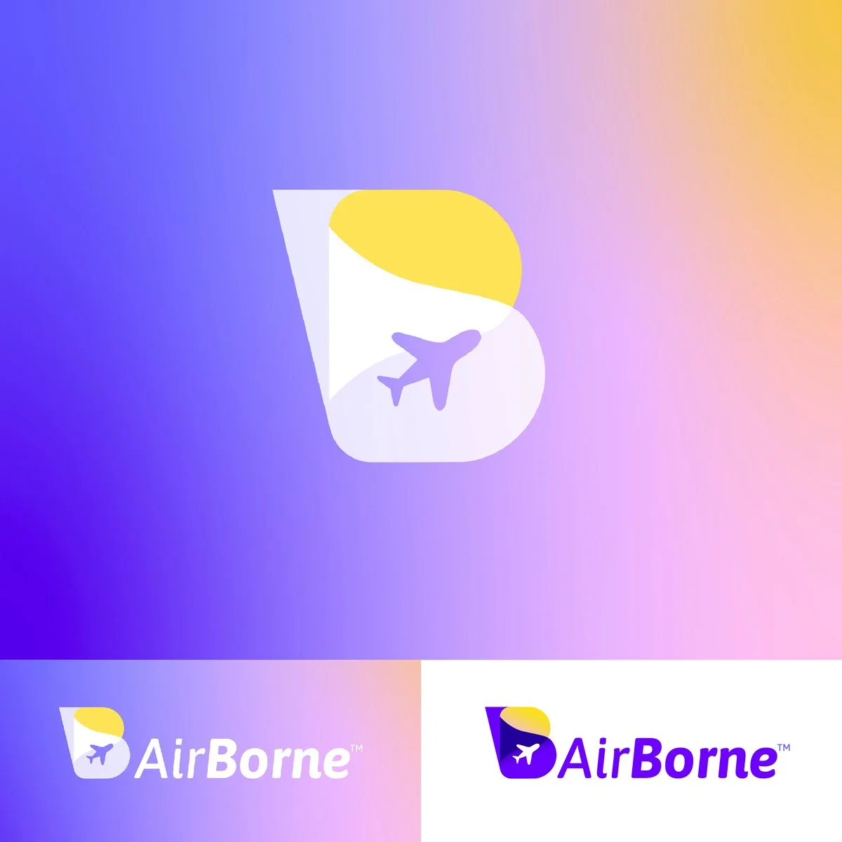
I designed two logo options for the AirBorne brand identity. I wanted my logo to have a strong lockup that can be used as an identifying brand mark even when not used alongside the brand name - e.g., on app icons. I moved forward with option B for its unique overall shape that mimics the shape of an aircraft's vertical stabiliser. The overlapping arches that make up the “B” represent the flight from its origin (translucent white), journey (opaque white), and destination (yellow). I then defined my icons and imagery style, aligning with my brand's tone of voice. For the fonts, I chose ASAP as it feels modern and easy to read, but also has round letters, and curves and flows in a way which is friendly and makes me think of movement. All my colours were checked against WCAG AA standard, and I made small edits to ensure all were AA compliant.
Software Used: Figma, Adobe Illustrator, Adobe Photoshop


User Flow and Wireframes
User Flow Diagram
When creating my user flow diagram, I put myself in the shoes of the user's experience in navigating the flow of the pages. I went through this journey myself on numerous competitor sites to evaluate what made my booking experience easy versus difficult. I decided on creating an additional page for a better user experience. This page is for users to ‘like’ deals and searches so that they can easily compare deals or return to them later to complete their purchase instead of having to redo their trip details each time. I also outlined which pages required Ideal, Partial, Loading, Error, and Empty states.
Wireframes
I created wireframes for each of my pages and states. These pages were simple outlines but gave me a chance to consider content hierarchy and tone of voice for the copy.
Mid-fidelity Designs:
Next, I started creating my base mid-fidelity designs, in tandem with building a design system.
Software Used: Figma


Design System
I created the foundations for the AirBorne design system. This includes consistent naming conventions and a toolbox of colours, fonts, plugins, grids, patterns, and components, which I added to and updated as I built out the prototypes.
Software Used: Figma, Adobe Photoshop

User Testing
Prototype Testing
After completing a clickable prototype of the booking user flow, as well as sample desktop and tablet pages, I sent my mid-fidelity prototypes out to 6 users for testing. Alongside having a few small inconsistencies and errors picked up, I received some additional feedback on the length of my booking pages and the number of buttons to click through. Through this testing feedback, I simplified the booking process, which I believe greatly improved the design.
Software Used: Figma
High-Fidelity Prototype
This project was presented and submitted. The high-fidelity prototype for the Airborne app can be used here: AirBorne Prototype
Software Used: Figma